QUÉ | WHAT
IDENTIDAD VISUAL
Vivimos en un mundo cada vez más saturado de imágenes, por eso, en Ana Cortils Comunicación Visual entendemos la importancia de crear mensajes visuales claros, impactantes, fáciles de recordar y que aporten valor.
Para ello diseñamos todo aquello que contribuye a hacer más visible tu marca o proyecto:
• logos • papelería • folletos • catálogos • memorias anuales • carteles • manuales de aplicación de marca • páginas web • aplicaciones online (apps) • newsletters • imágenes para redes sociales • videos publicitarios • animación de logos...
Hoy más que nunca, tener una identidad visual impactante y bonita es fundamental para el desarrollo económico de tu empresa porque despierta en los consumidores sentimientos positivos, de afecto hacia tu marca o proyecto.
Algunos de nuestros proyectos de identidad visual singulares han sido el acompañamiento durante más de doce años a la expansión de la empresa SingleHome, o el Hotel Finca Cortesín (Casares, Malága) para el que escogí –cuando no existía nada– un elemento enseña del paisaje, un algarrobo, como símbolo. Me llena de satisfacción que los once años dedicados a la creación y desarrollo de su identidad y comunicación visual hayan contribuido a su éxito.
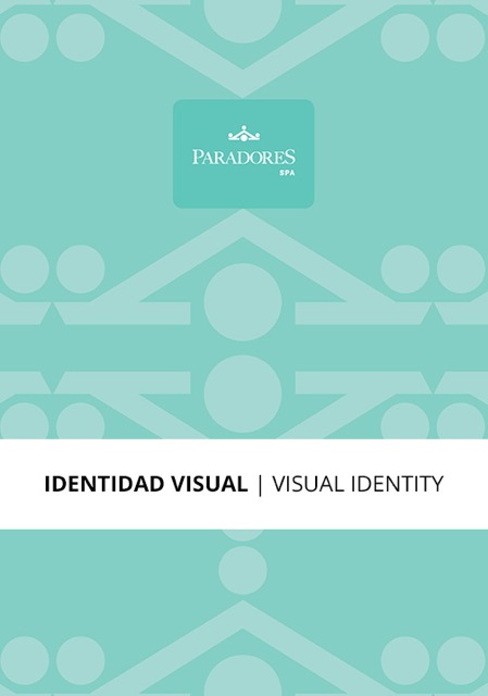
También hemos renovado la identidad visual de Paradores de España y sus cinco segmentos –Gastronomía, Bodas, Golf, Spa, y Reuniones Corporativas (MICE)–, diseñando un nuevo logo y un manual de aplicaciones de marca que lo dotan de un espíritu más luminoso, fresco y actual.
Este proyecto de renovación de la institución surgió cuando más estaba siendo afectada por la larga crisis de 2008. Un planteamiento inteligente por parte de Paradores, ya que es precisamente en los momentos difíciles cuando hay que invertir en renovar la propia imagen de marca, haciéndonos más visibles entre los competidores.
LIBROS
En ACCV nos apasionan los libros bonitos, diferentes, raros, impactantes... Diseñar un libro es crear un pequeño mundo en el que resulte un placer perderse; es crear un objeto del que nunca querríamos desprendernos. Soy de la idea de que, en la era digital en la que vivimos, y con un medio ambiente que necesita de nuestro cuidado, cada libro diseñado ha de aspirar a ser una pequeña obra de arte. Al menos así lo sentimos en ACCV.
Hacemos, de principio a fin,
• libros corporativos • libros para editoriales • catálogos para galerías de arte o museos • ejemplares únicos
En cualquiera de estos casos, son un importante elemento para reforzar la identidad visual y el prestigio.
Libros Corporativos
Para la celebración de su 20 aniversario, TF. Artes Gráficas me pidió “crear un producto memorable y sensible –que pusiera de manifiesto su alta calidad profesional sin ostentación– destinado a clientes de un alto perfil cultural”.
PLANTEAMIENTO: Veinte años de ejercicio profesional suponen una importante parte de la vida. La ‘Vida’, pues, debía ser el tema, y el objeto a diseñar, un libro.
RETO: Crear un libro totalmente visual sobre la Vida, que invitase al espectador a reflexionar sobre sus diferentes aspectos y que, al mismo tiempo, permitiera mostrar el alto valor de TF. Artes Gráficas como imprenta –y editorial de libros de arte– utilizando técnicas de impresión sofisticadas y sobrias.
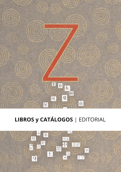
PROCESO: La palabra ‘zibaldone’ significa en italiano ‘cuaderno de recortes’, así que reuní en el libro collages, fotomontajes, e ilustraciones hechas por mí a lo largo de los años, y lo dividí en 5 capítulos o etapas de la vida: Nacimiento, Crecimiento, Madurez, Declive y Muerte. Según la fiosofía oriental, estas cinco etapas se repiten una y otra vez a lo largo de nuestras vidas, por lo que a la muerte sucede siempre otro nacimiento, enviando así un mensaje positivo. La sobria estética oriental impregnó sus páginas y me permitió utilizar los bellísimos ideogramas chinos –en negro y a gran tamaño– para nombrar cada capítulo, llenos éstos de color en su interior.
Así nació “Zibaldone de las cinco etapas de la vida. Nueve por cinco haikus visuales” uno de los proyectos más personales, gratificantes y queridos realizados en mi trayectoria profesional, y que me dio la impagable oportunidad de adquirir un conocimiento sobre técnicas de impresión al que muy pocos diseñadores llegan a tener acceso.
OBJETIVO CUMPLIDO: TF. Artes Gráficas sorprendió gratamente a sus clientes con el obsequio de un libro ‘diferente’ e impactante que contribuyó a reforzar su prestigio como empresa: su diseño y la suntuosidad de su impresión fueron reconocidas con un Premio Visual al Mejor Libro Corporativo, en España, y con los prestigiosos Graphis Gold Award y AIGA 50 Books - 50 Covers, en Nueva York, pasando a formar parte de la Colección AIGA de Diseño del Denver Artmuseum (EE.UU.).
Libros para Editoriales
Recientemente, Nagrela Editores me pidió diseñar un libro sobre arte del Holocausto para un texto del crítico y comisario de arte Javier Molins. Sobre la mesa de la sala de juntas había otros libros que abordaban este tema, pero vistos de lejos, cualquiera de ellos podía haber tratado sobre cualquier otro tipo de arte.
PLANTEAMIENTO: El Holocausto supuso una desolación sin precedentes; los artistas prisioneros no tenían materiales de dibujo o pintura para poder expresar lo que estaba sucediendo.
RETO: Crear un libro que, aún con los ojos entornados, o al tacto, hablara de pobreza absoluta, de falta de medios; que pareciera hecho 'con lo que había a mano'. Un libro-objeto 'provocador de emociones'.
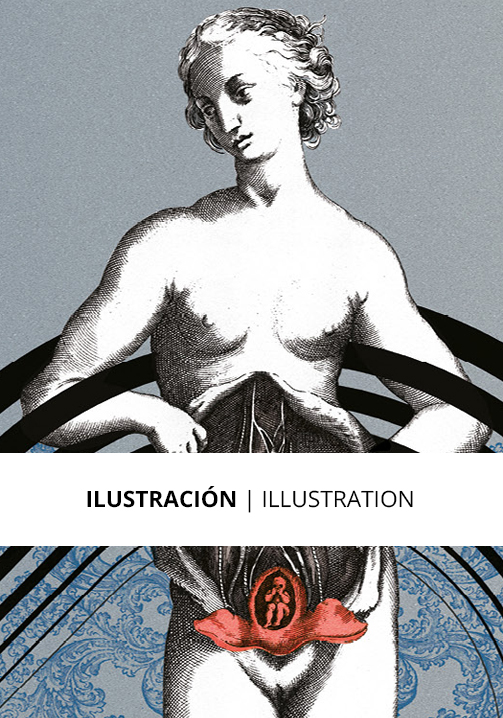
PROCESO: Para dar la sensación de 'hecho con lo que había a mano' utilizé materiales humildes –como cartón gris, papel de estraza y de embalar–, y pliegos de diferente tamaño, tono, textura y gramaje. Pinté los fondos de las portadillas con aguadas de hollín y brochas viejas, como habrían hecho los artistas prisioneros. En cada una de las 77 biografías del texto se detallan los periplos de cada artista por diferentes guetos, prisiones y campos de concentración, por lo que decidí unir los puntos en el mapa y visualizarlos como si se trataran de constelaciones: el destino en las estrellas como metáfora. La encuadernación deja vistos los hilos del lomo y al cartón de la portada le falta un trozo...
OBJETIVO CUMPLIDO: Este trabajo de concepto y diseño proporcionó a "Artistas en los campos nazis", y a Nagrela Editores, uno de los Premios del Ministerio de Cultura a los Libros Mejor Editados en 2019, aumentando considerablemente su prestigio como editorial. Con motivo del 75 Aniversario de la Clausura del Campo de Concentración de Auschwitz, el Rey Felipe VI llevó nuestro libro-objeto como obsequio al Presidente de Polonia.
Catálogos para Galerias de Arte o Museos
Entre muchos otros, he hecho para la Galería Javier López el catálogo de la exposición “Once in a Lifetime”, del artista pop niuyorkino Alex Katz. De gran tamaño, este catálogo es el mejor impreso –de mayor fidelidad de color– de los numerosos publicados a lo largo de su larga y exitosa trayectoria artística.
ILUSTRACIÓN-VIDEO
Las ilustraciones y vídeos, tanto si son artísticos como técnicos o publicitarios, 'iluminan', aportan claridad y calidad a los proyectos de identidad visual. Hemos realizado todo tipo de ellos. En el ámbito corporativo, "Zibaldone de las cinco etapas de la vida" es un libro cien por cien visual, para el que creé 45 imágenes artísticas. En "Artistas en los campos nazis", 77 constelaciones –esquemas– visualizan el periplo de 77 artistas, animando visualmente sus páginas. También hemos creado numerosos gráficos e infografías para memorias anuales y otros tipos de publicaciones y logos animados. Cada proyecto requiere unas necesidades visuales que podemos realizar. Consúltanos.
VISUAL IDENTITY
We live in a world that is increasingly saturated with images, which is why at Ana Cortils Visual Communication we understand the importance of creating clear, impressive, easy-to-remember visual messages that add value.
For this we design everything that contributes to making your brand or project more visible:
• logos • stationery • brochures • catalogs • annual reports • posters • brand application manuals • web pages • online applications (apps) • newsletters • images for social networks • advertising videos • logo animation...
Today more than ever, having an impressive and beautiful visual identity is essential for the economic development of your company because it awakens positive feelings in consumers, of attention and affection towards your brand or project.
Some of our unique visual identity projects have been accompanying the expansion of the SingleHome company for more than twelve years, or the Hotel Finca Cortesín (Casares, Malága) for which I chose –when nothing existed– a standard element of the landscape , a centenary carob tree, as a symbol. It fills me with satisfaction that the eleven years dedicated to the creation and development of its identity and visual communication have contributed to its success.
We have also renewed the visual identity of Paradores de España and its five segments –Gastronomy, Weddings, Golf, Spa, and Corporate Meetings (MICE)–, redesigning its logo and creating a brand application manual that give it a brighter spirit , fresh and current.
This project to renew the institution came about when it was being most affected by the long crisis of 2008. An intelligent approach on the part of Paradores, since it is precisely in difficult times when we must invest in renewing our own brand image, making ourselves more visible among the competitors.
SPECIAL and RARE BOOKS
At ACCV we are passionate about beautiful, different, rare, impressive books... Designing a book is creating a small world in which it is a pleasure to get lost; it is to create an object that we would never want to part with. I am of the idea that, in the digital age in which we live, and with an environment that needs our care, each designed book must aspire to be a small work of art. At least that’s how we feel at ACCV.
We do, from start to finish,
• corporate books • books for publishers • catalogs for art galleries or museums • one of a kind books
In any of these cases, they are an important element to reinforce visual identity and prestige.
Corporate Books
For the celebration of its 20th anniversary, TF. Graphic Arts asked me to “create a memorable and sensitive product –that would show its high professional quality without ostentation– aimed at clients with a high cultural profile”.
APPROACH: Twenty years of professional practice represent an important part of life. ‘Life’, then, had to be the theme, and the object to be designed, a book.
CHALLENGE: Create a totally visual book about Life, which invites the viewer to reflect on its different aspects and, at the same time, allows showing the high value of TF. Graphic Arts as a printing press –and publisher of art books– using sophisticated and sober printing techniques.
PROCESS: The word ‘zibaldone’ means ‘scrapbook’ in Italian, so I put together in the book collages, photomontages, and illustrations made by me over the years, and divided it into 5 chapters or stages of life: Birth, Growth, Maturity, Decline and Death. According to Eastern philosophy, these five stages are repeated over and over again throughout our lives, so death is always followed by another birth, thus sending a positive message. The sober oriental aesthetic permeated its pages and allowed me to use the beautiful Chinese ideograms –in black and in large size– to name each chapter, filled with color inside.
Thus was born “Zibaldone of the five stages of life. Nine for five visual haikus” one of the most personal, rewarding and beloved projects carried out in my professional career, and which gave me the priceless opportunity to acquire knowledge about printing techniques that very few designers have access to.
OBJECTIVE ACCOMPLISHED: TF. Artes Gráficas pleasantly surprised its clients with the gift of a ‘different’ and impressive book that contributed to reinforcing its prestige as a company: its design and the sumptuousness of its printing were recognized with a Premio Visual (Visual Award) for Best Corporate Book, in Spain, and with the prestigious Graphis Gold Award and AIGA 50 Books - 50 Covers, in New York, becoming part of the AIGA Design Collection of the Denver Artmuseum (USA).
Books for Publishers
Nagrela Editores recently asked me to design a book on Holocaust art for a text by art critic and curator Javier Molins. There were other books on the boardroom table on this subject, but seen from afar, any one of them could have been about any other kind of art.
APPROACH: The Holocaust was an unprecedented desolation; the imprisoned artists had no drawing or painting materials to be able to express what was happening.
CHALLENGE: Create a book that, even with half closed eyes, or to the touch, would speak of absolute poverty, of lack of means; that it seemed made ‘with what was at hand’. A book-object ‘provoking emotions’.
PROCESS: To give the feeling of ‘made with what was at hand’ I used humble materials –such as gray cardboard, grey butcher paper and packing paper–, and sheets of different sizes, tones, textures and weights. I painted the backgrounds of the title pages with soot washes and old brushes, as the imprisoned artists would have done. In each of the 77 biographies of the text, the journeys of each artist through different ghettos, prisons and concentration camps are detailed, so I decided to join the points on the map and visualize them as if they were constellations: destiny in the stars as a metaphor. The binding leaves the threads of the spine visible and the cardboard of the cover is missing a piece...
OBJECTIVE ACCOMPLISHED: This concept and design work provided “Artistas en los campos nazis” (Artists in the Nazi Camps), and Nagrela Editores, with one of the Ministry of Culture Awards for Best Published Books in 2019, considerably increasing its prestige as a publisher. On the occasion of the 75th Anniversary of the Closing of the Auschwitz Concentration Camp, King Felipe VI brought our book-object as a gift to the President of Poland.
Catalogs for Art Galleries or Museums
Among many others, I have made the catalog for the exhibition “Once in a Lifetime” by the New York pop artist Alex Katz for the Javier López Gallery. Large in size, this catalog is the best printed –with greater color fidelity– of the many published throughout his long and successful artistic career.
ILLUSTRATION-VIDEO
Illustrations and videos, whether they are artistic, technical or advertising, ‘illuminate’, bring clarity and quality to visual identity projects. We have done all kinds of them. In the corporate sphere, “Zibaldone of the five stages of life” is a one hundred percent visual book, for which I created 45 artistic images. In “Artists in the Nazi Camps”, 77 constellations –schemes– visualize the journey of 77 artists, visually animating their pages. We have also created numerous graphics and infographics for annual reports and other types of publications and animated logos. Each project requires visual needs that we can perform. Please, ask us.